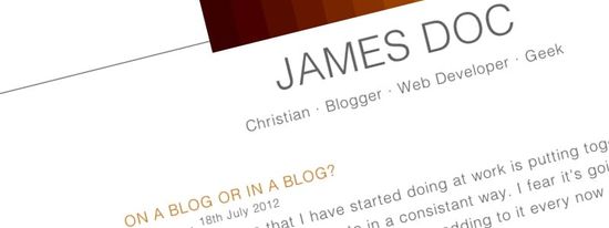
Some of you may have noticed that in the last couple of weeks I've pushed a fairly major update to my website, version 6 by my reckoning. I've ditched the dark red and black instead favouring a white background, and now have several shades of tea for highlighting different content types. I've also used this opportunity to start playing around a bit with CSS transforms, part of the CSS3 specification.
One of the major goals for v6 were to simplify the design and to make it more readable. I took inspiration from the blogs of Maykel Loomans and the Information Architects who both have stunningly simple and readable websites. One of the major things that stuck me by their designs was the narrow width of the site, meaning that they don't try and squeeze too many words into each line of text.
I've got several minor updates mulling around in my mind that I want to sit down and work up at some point in the near future including good Open Graph support, searching in the blog, a better archive design, some improvements to the menu, etc. However I would really value your feedback; what do you like or dislike? How can I make improvements to the site? What should I be writing about? Let me know in the comments below!
Post changelog
- 2020-05-17 – Decouple gulp from SCSS generation
- 2018-12-24 – Generate (but not use yet) RWD images
- 2018-09-01 – Importing all the old blog posts
