Earlier in the year Andrew Lewis wrote a post going through some of the research he had done looking into the user experience of connecting to public Wi-Fi. He pulled out many examples from other museums and beyond to see what worked well and what needed to be improved upon. This was not just an academic exercise, we have known for a while that accessing our own public Wi-Fi left a lot to be desired, and one of the things that has been on my mind for a while is ensuring that our digital welcome is as beautiful and inspiring as our physical welcome here at the V&A.
The two important things we wanted to achieve with a refreshed splash screen design were:
- Make it clear, quick and simple to connect to the Wi-Fi. This meant reducing/removing the number of hoops our visitors are forced to make in order to access the internet
- Display some of the V&A’s collection to show off some more of what is within our walls
Ground work

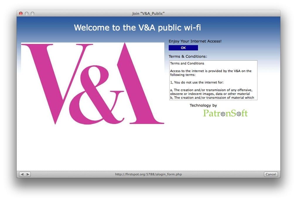
While there isn’t a great deal of content on the original splash screen, it was important to make sure that we were including the right things, drawing attention to the important things, and removing the things that didn’t need to be there. A quick glance showed we had several elements:
- Welcome message heading
- V&A logo
- Welcome subheading
- Connect button
- Terms and conditions
- Vendor logo
When put into a visual order the V&A logo stood out very clearly, perhaps because it was giant… and pink, closely followed by the terms and conditions. But the most important thing, the blue ‘connect’ button, blends into the blue background. Instead, the order should reflect what the user needs: As a visitor trying to access the public Wi-Fi, I need to get past the splash screen as quickly as possible so I can… [upload this incredible selfie with Bashaw].
Visual hierarchy
- V&A logo: Assure our visitors they have connected to the correct Wi-Fi
- Connect button: People just want to get through this screen to the internet
- ‘It is free’: The our visitors we are not expecting them to pay for the Wi-Fi access – set the expectation.
- Image from the collections: Show off something beautiful from within the museum
- Terms and conditions: We need to make sure these are available to read and to set the expectation that use of the Wi-Fi is lawful, responsible and reasonable.
Sketching

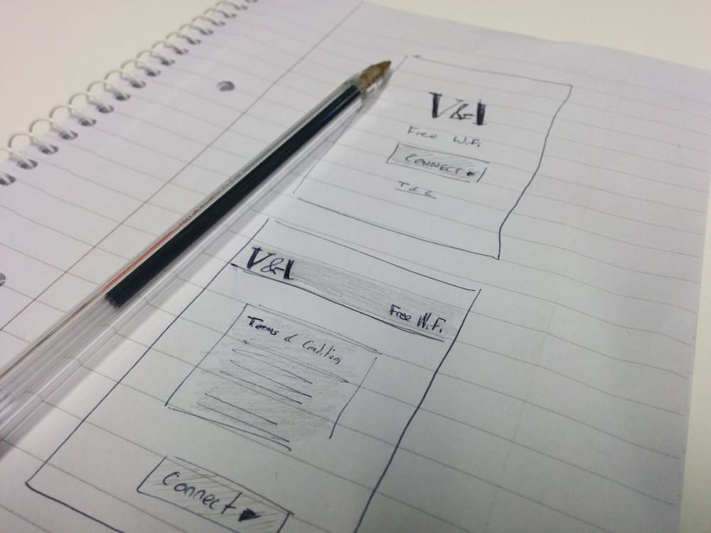
The first place the visual design starts to come together always seems to be on the back on a scrap bit of paper or quickly jotted down in a notebook.
From the two sketches above we decided to take the first one forward. While the concept around the second drawing matched the visual identity of the main V&A website, we felt that it raised the T&Cs too highly in the visual identity – the focus was on the legal text rather than on what the user actually wanted to do: connect to the Wi-Fi. Similarly the V&A logo and the ‘free Wi-Fi’ text were competing with each other for space. Meanwhile, the first design led the visitor’s eye clearly down the steps in the hierarchy.
With a rough design sketched out in a notebook I took the design into a more visually complete design using the Mac app Sketch. It allows me to very quickly turn a rough ‘back of paper’ idea into a full idea that can be tweaked and moved around. It also makes it very easy to get feedback from people who might be confused by the simple paper drawing.

Four variation were created from the original paper sketch with changes to the welcome text, positioning of the terms and conditions and how the overlay on top of the background image works. While I was keen to keep the T&Cs link at the bottom of the page, outside of the overlay it meant that we had to limit the choice of background images as the text vanished on lighter backgrounds.
Building it
The hardware we use to control access to the public Wi-Fi uses a template language called Smarty to separate the programmatic logic from the front end design. The result of this is that as I was adjusting the existing template I did not need to worry about breaking any of the backend operations of the connecting process because all of that logic is separate.
In my opinion the most striking thing about the new splash screen is the changing background images, and I wanted to ensure that that they still looked beautiful and inspiring, regardless of the size of screen they appeared on. In the past I have been content to just let the CSS looking after the responsive backing image, which has often meant that the image would be automatically cropped at its centre. For some of these objects this worked very well, but for others it left the main focus of the image off the screen. This is where the wonderful piece of JavaScript by Jono Menz called Focus Point comes in handy. Labeled as “intelligent cropping for flexible image containers”, it is a perfect fit for background images for devices where we have no idea of the size of the screen and ensures that the focal point of the image is always on screen.
While I was going through a lot of the code Lizzy Bullock and Keith Hale were working their way through our image library to pick out a set of images that showed the beauty and diversity of the collections. This included images from our Theatre and Performance galleries through to the Raphael Cartoons.
Testing and open device labs
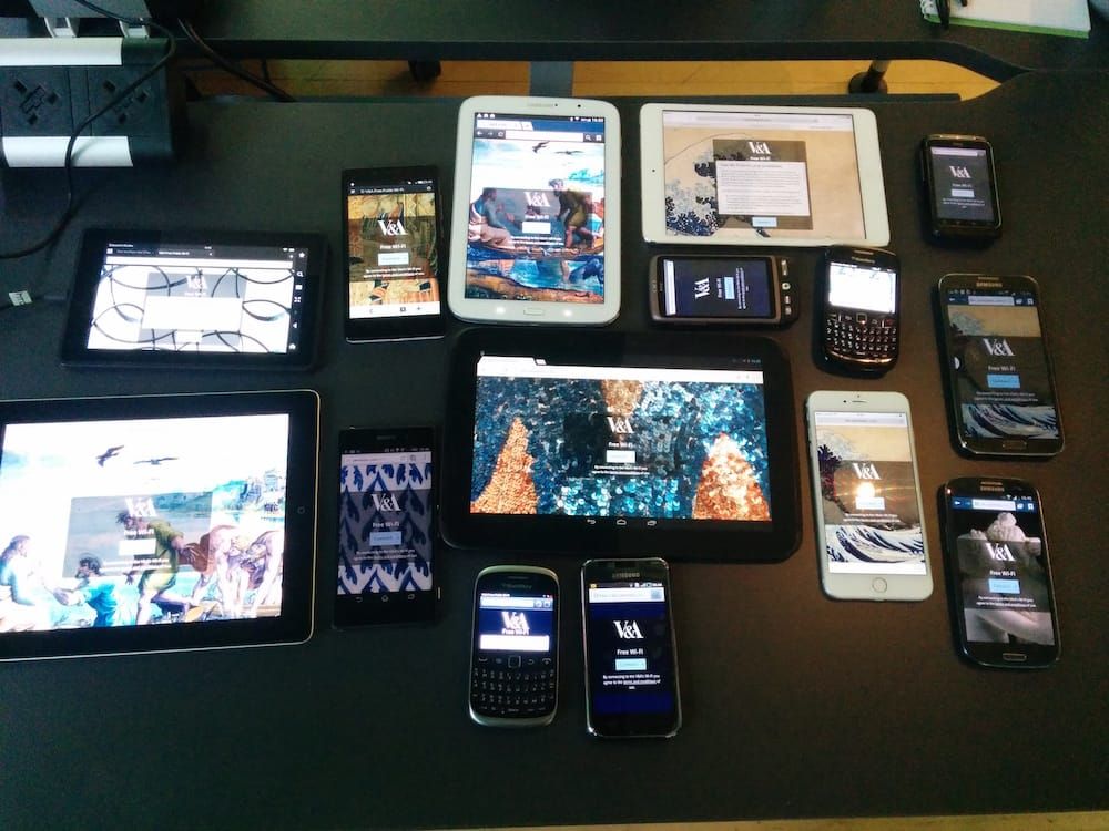
Internally we did a lot of testing, making sure that everything through to IE7 played ball with the new splash screen, but we were very aware that the majority of users would not be accessing the Wi-Fi through their laptops. Instead, mobile phones and tablets would be sending the most traffic to the Wi-Fi. Pooling together all the devices in the Digital Media Team’s pockets we had several iPhones of various generations, an iPad and a few Android devices we were able to test. It was a good start but nowhere near the diversity of devices that connect on a daily basis to the V&A public Wi-Fi.

Testing on many devices has long been an issue, however, Open Device Labs (ODLs) recently have been popping up all over the world allowing product testers to go in and access many more mobile devices. Thanks to the ODL hosted by Fool Proof I was able to test the splash screen on many more devices and to catch several bugs, including a massive oversight in not testing at a Blackberry screen resolution. I was able to take these evaluations back to the office and create fixes for them before launch.
We’re not finished yet
The new Wi-Fi splash screen was launched to the museum on 15th October and so far we have received a lot of positive feedback. We have many other plans for improving the screens including giving visitors the option of signing up for the V&A newsletter or highlighting some of the digital offers around the building.
So, when you are next passing by the V&A, do come in and check out the updated splash screen, and if you have any feedback or suggestions please feel free to tweet them at me.
Post changelog
- 2023-05-29 – Resume
- 2022-01-13 – Tidy up a number of blog posts for tags
- 2020-05-17 – Decouple gulp from SCSS generation
- 2018-12-24 – Generate (but not use yet) RWD images
- 2018-09-01 – Found old V&A posts
https://www.vam.ac.uk/blog/digital/designing-a-new-wi-fi-splash-screen
